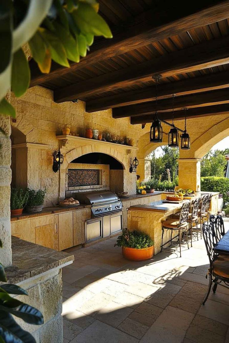
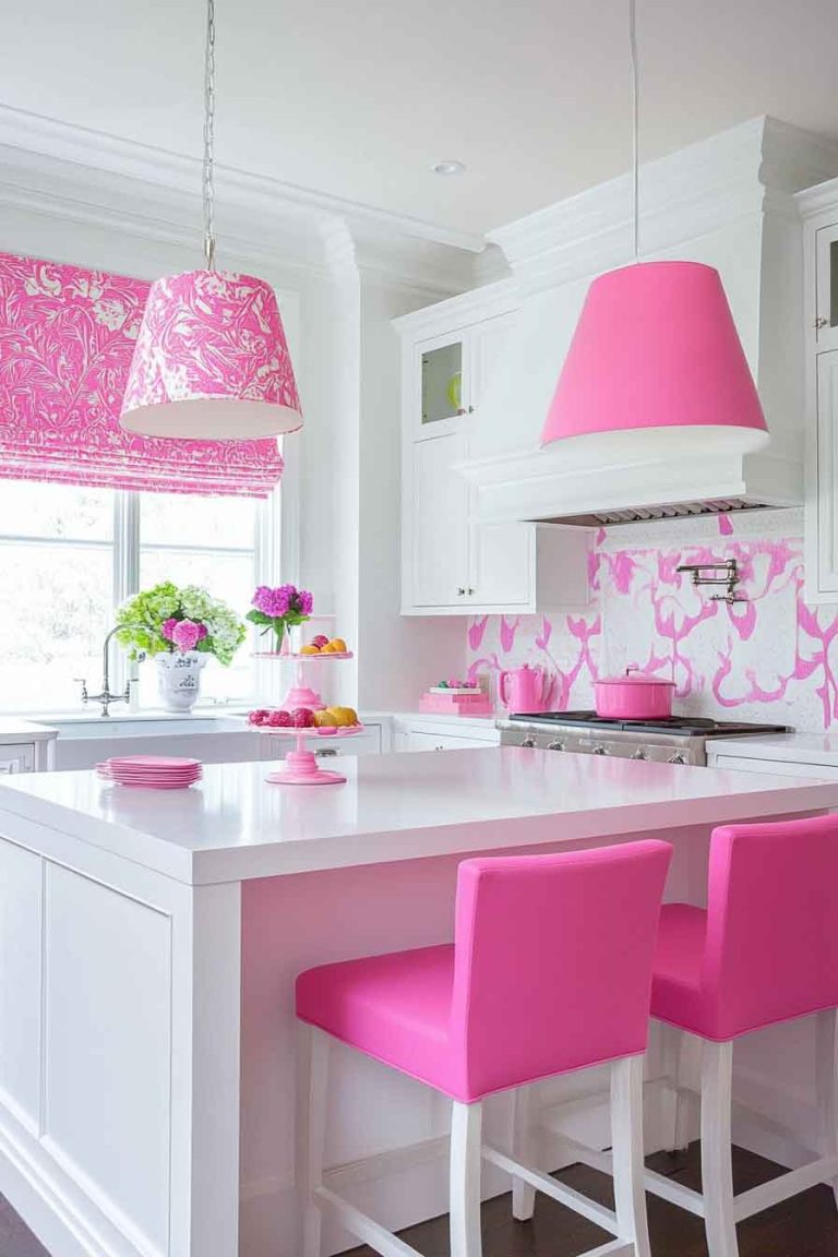
30 Best Kitchen Color Schemes: Creating Your Perfect Culinary Haven

Choosing the right color scheme for your kitchen is more than just picking your favorite colors; it’s about creating a space that inspires creativity, promotes functionality, and reflects your personal style. The kitchen serves as the heart of the home, where families gather, meals are prepared, and memories are made.
Thoughtful color selection plays a crucial role in transforming this essential space into a welcoming environment that balances beauty with practicality.
The concept of kitchen color scheme ideas embraces the interplay of hues, tones, and shades that work together to create visual harmony while enhancing the room’s atmosphere. From bold and energetic combinations to soft and soothing palettes, the right color scheme can completely transform your cooking space.
This comprehensive guide explores 30 stunning kitchen color schemes, showcasing how different combinations cater to various design styles and personal preferences. From classic white kitchens to dramatic navy spaces, each scheme offers its own unique character while maintaining functionality and style.
Join us as we explore these captivating color schemes for kitchens, each providing practical tips and inspiration for creating your ideal cooking and gathering space.
1. Classic White and Grey Kitchen
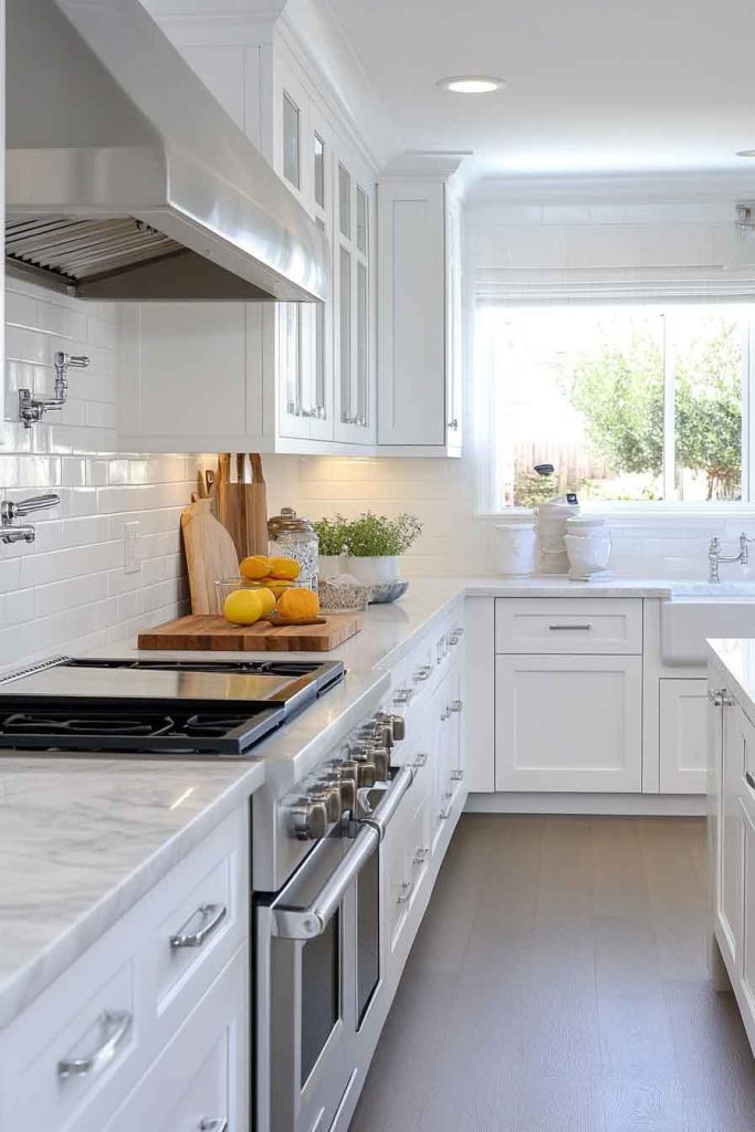
Imagine stepping into a bright kitchen where crisp white cabinets meet soft grey countertops, creating a timeless and elegant foundation. The white cabinetry reflects natural light beautifully, while grey marble or quartz counters add subtle sophistication without overwhelming the space.
Stainless steel appliances complement this neutral palette, and a white subway tile backsplash completes the clean, fresh look. Large windows allow sunlight to bounce off the white surfaces, making the kitchen feel spacious and airy.
The overall mood of this kitchen is one of cleanliness and serenity. The combination of white and grey creates a versatile backdrop that works with any decor style, from modern to traditional, while the neutral palette ensures the space never feels dated.
This design promotes a sense of calm and order, making it the perfect environment for both everyday cooking and entertaining guests.
Design Tips:
- Choose white cabinets in a durable finish that resists stains and yellowing
- Select grey countertops with subtle veining for added visual interest
- Incorporate stainless steel hardware for a cohesive, modern look
- Add warmth with wooden cutting boards and natural fiber accessories
2. Navy Blue and Brass Kitchen
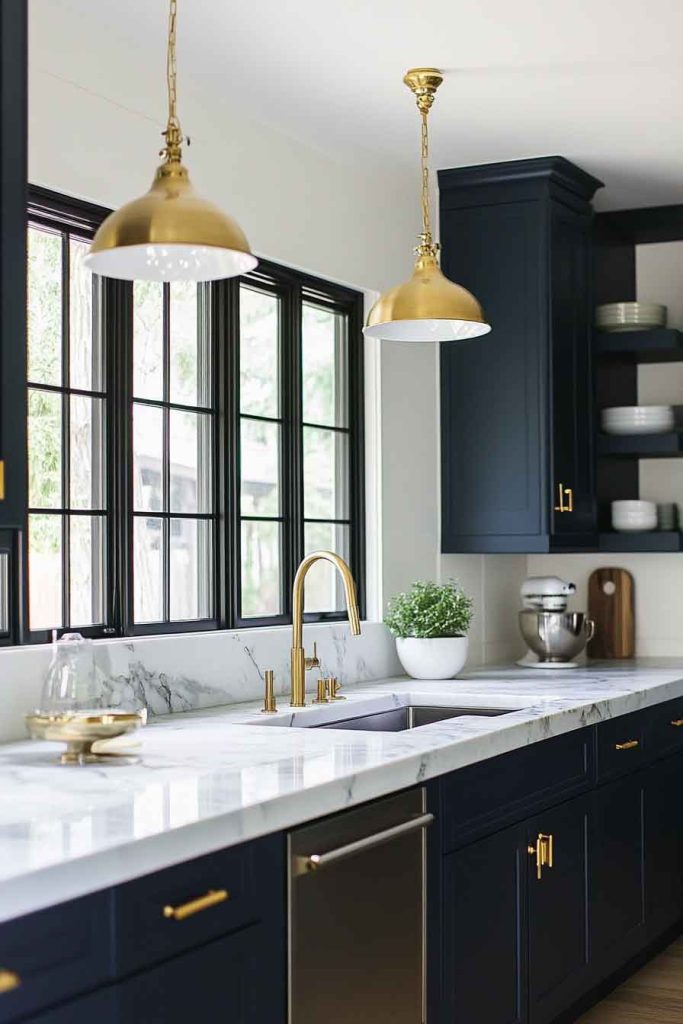
In this sophisticated kitchen, deep navy blue cabinets create a bold statement paired with warm brass hardware and fixtures. The navy cabinetry provides rich depth, while the brass accents catch the light and add a touch of luxury to the space.
White marble countertops offer a bright contrast against the dark cabinets, and a white or cream backsplash keeps the space feeling balanced. Pendant lights with brass finishes hang above the island, tying the entire look together.
This color scheme emphasizes elegance and refinement. The navy blue adds drama and personality, while the brass introduces warmth that prevents the space from feeling too dark or heavy.
The contrast between the dark cabinets and light counters creates visual interest and depth.
Design Tips:
- Use navy on lower cabinets and white or cream on upper cabinets if navy feels too overwhelming
- Choose brass fixtures with a satin or brushed finish for a modern take on the classic combination
- Incorporate white or light-colored countertops to balance the dark cabinetry
- Add open shelving with brass brackets to break up the navy and display favorite dishes
3. Sage Green and Natural Wood Kitchen
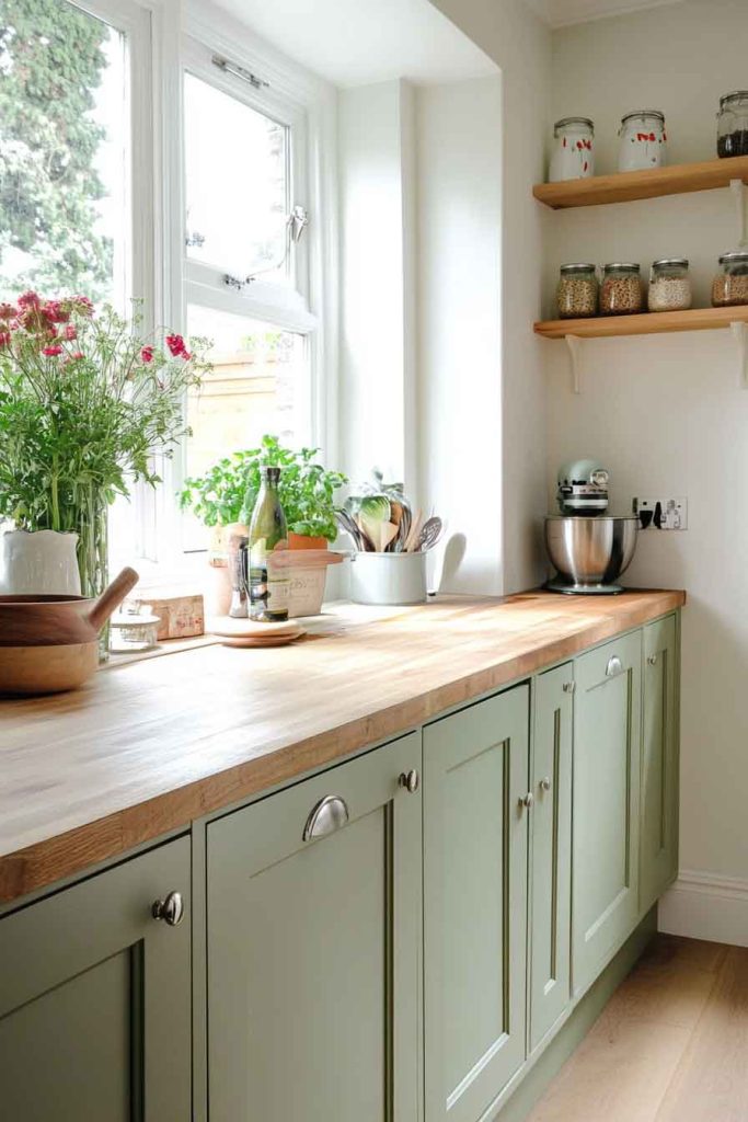
This calming kitchen showcases soft sage green cabinets that pair beautifully with natural wood countertops or shelving. The sage green brings a fresh, organic feel to the space, while the wood elements add warmth and texture.
White or cream walls create a light backdrop that allows the green to shine without overwhelming the room. Natural light streaming through windows enhances the peaceful, garden-like atmosphere.
The combination of sage green and wood creates a connection to nature that promotes relaxation and well-being. This color scheme works wonderfully in kitchens that open to gardens or outdoor spaces, creating a seamless flow between indoors and out.
The overall effect is tranquil and inviting, perfect for those who appreciate a more organic, earthy aesthetic.
Design Tips:
- Select a muted sage green rather than a bright green for a sophisticated look
- Incorporate butcher block counters or wooden floating shelves for warmth
- Use white or cream for walls and backsplash to keep the space feeling bright
- Add plants and herbs in the kitchen to enhance the natural, organic theme
4. Black and White Kitchen with Gold Accents
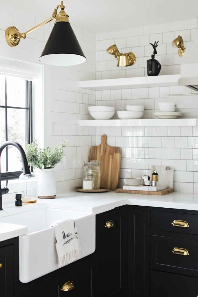
This striking kitchen features a classic black and white color scheme elevated by luxurious gold accents. Black lower cabinets anchor the space, while white upper cabinets prevent the design from feeling too heavy.
A white subway tile backsplash with black grout adds pattern and interest, and gold cabinet hardware, faucets, and light fixtures provide glamorous finishing touches.
The high contrast between black and white creates a dramatic, sophisticated atmosphere. The addition of gold accents introduces warmth and luxury, transforming what could be a stark palette into an elegant, refined space.
This kitchen makes a bold statement while remaining timeless and versatile.
Design Tips:
- Balance black and white by using them in equal or complementary proportions
- Choose gold hardware in a warm tone rather than bright yellow gold
- Add a patterned tile floor to introduce additional visual interest
- Incorporate white or light countertops to break up the dark lower cabinets
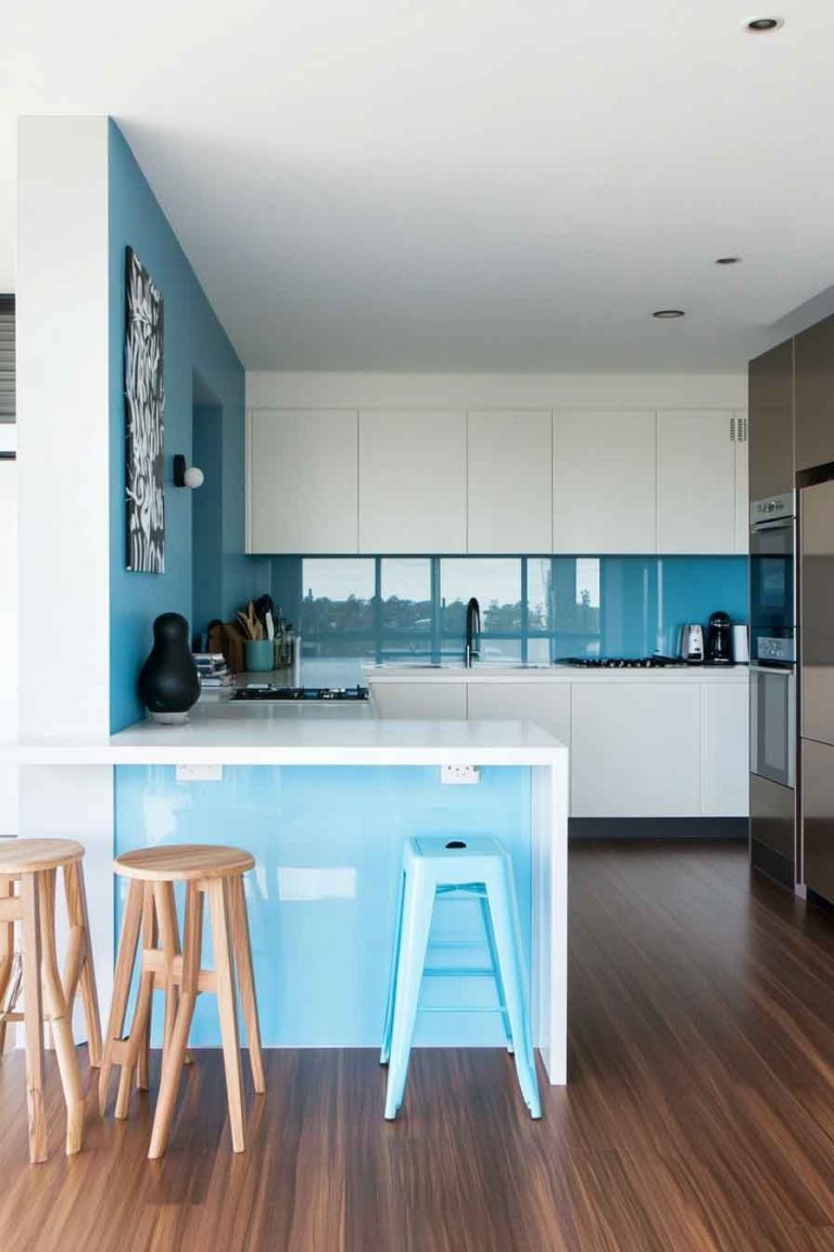
5. Soft Blue and White Kitchen
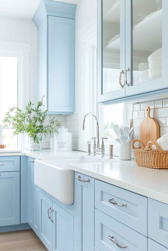
In this airy kitchen, soft powder blue cabinets create a serene atmosphere paired with crisp white countertops and walls. The gentle blue evokes a coastal, relaxed feeling without being overly themed.
White marble or quartz counters provide a clean work surface, while a white backsplash keeps the space feeling fresh and open. Natural light fills the room, reflecting off the light surfaces and creating a bright, cheerful environment.
This color scheme promotes peace and tranquility, making the kitchen a pleasant place to start your day. The soft blue is calming without being cold, and the abundance of white ensures the space never feels dark or cramped.
It’s an ideal choice for those who want color without overwhelming boldness.
Design Tips:
- Choose a blue with grey undertones for a more sophisticated look
- Keep hardware simple with brushed nickel or chrome finishes
- Incorporate natural textures like woven baskets or wooden accessories for warmth
- Use white or light-colored flooring to maintain the airy, open feeling
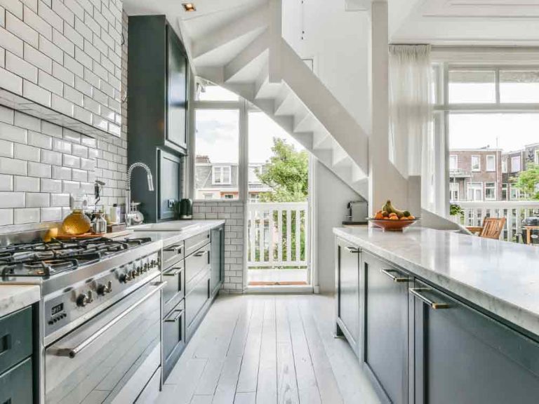
6. Charcoal Grey and Marble Kitchen
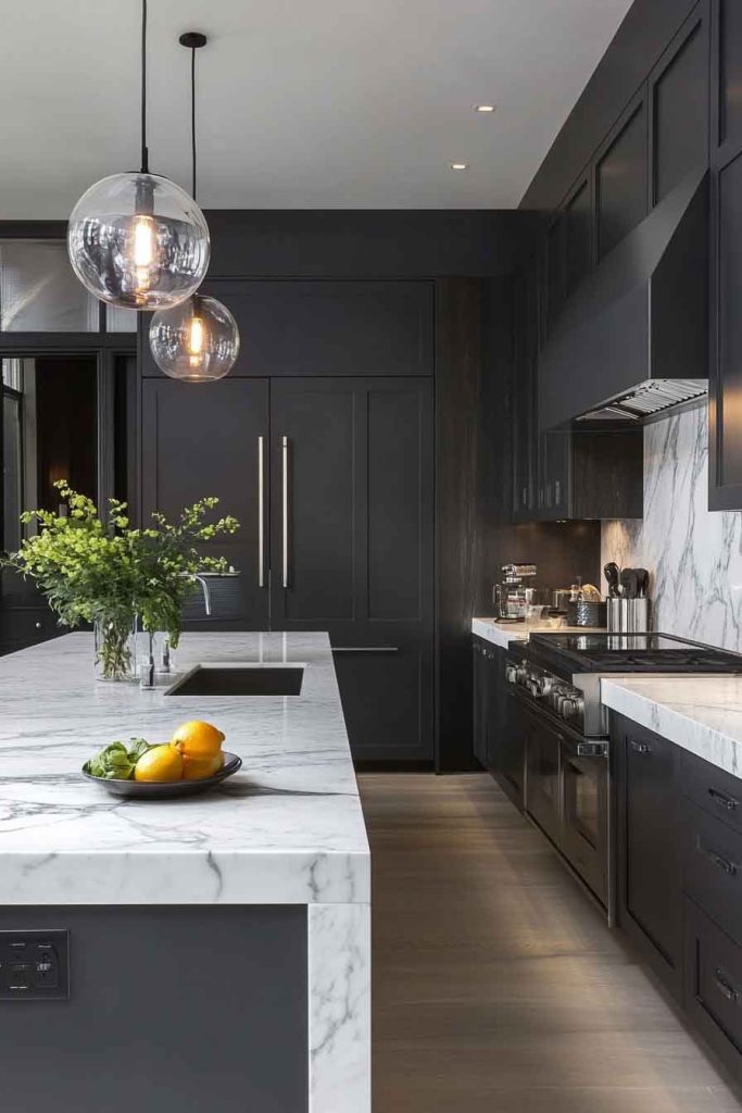
This modern kitchen showcases deep charcoal grey cabinets that exude contemporary sophistication when paired with white marble countertops. The dark grey creates a sleek, urban feel, while the veined marble adds natural beauty and elegance.
Stainless steel appliances integrate seamlessly into this color scheme, and under-cabinet lighting illuminates the counters and highlights the marble’s unique patterns. Large windows or glass doors provide contrast and prevent the space from feeling too enclosed.
The combination of charcoal and marble creates a luxurious, high-end aesthetic. The dark cabinets provide drama and depth, while the white marble brings light and visual interest through its natural veining.
This kitchen feels both modern and timeless, perfect for those who appreciate clean lines and quality materials.
Design Tips:
- Install adequate lighting to prevent the dark cabinets from making the space feel dim
- Choose marble with prominent veining to add visual interest and movement
- Incorporate glass-front cabinets or open shelving to break up the solid grey
- Add a pop of color through fresh flowers or a bowl of bright fruit
7. Cream and Terracotta Kitchen
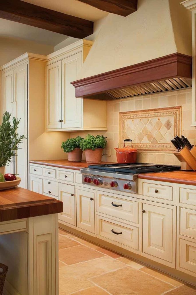
This warm and inviting kitchen features cream-colored cabinets complemented by terracotta tile accents or a terracotta-painted island. The cream provides a soft, neutral foundation, while the terracotta introduces earthy warmth and Mediterranean charm.
Wooden countertops or butcher block surfaces enhance the natural, organic feel of the space. Brass or copper hardware adds additional warmth and ties the color scheme together beautifully.
This color combination creates a cozy, welcoming atmosphere that feels both rustic and refined. The terracotta adds personality and warmth without overwhelming the space, while the cream keeps everything feeling light and approachable.
It’s perfect for those who want a kitchen that feels lived-in and loved.
Design Tips:
- Use terracotta as an accent rather than the dominant color for balance
- Incorporate cream or white for upper cabinets to maintain brightness
- Choose natural materials like wood, stone, and clay for accessories
- Add greenery with potted herbs or plants to complement the earthy palette
8. White and Butcher Block Kitchen
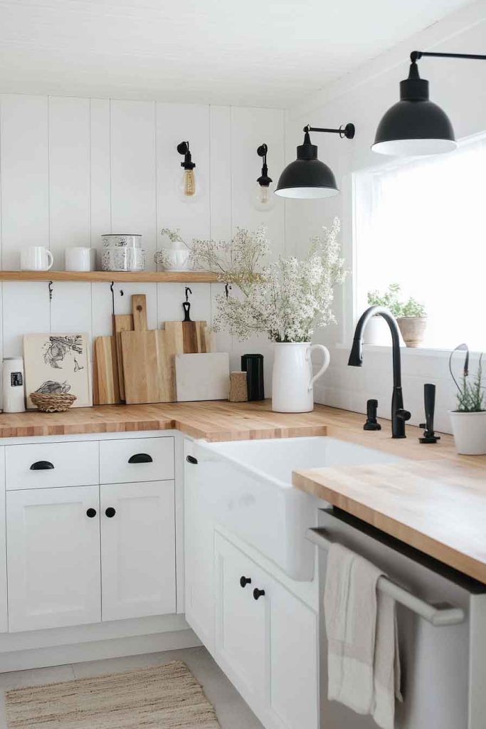
In this classic Scandinavian-inspired kitchen, bright white cabinets pair with warm butcher block countertops to create a perfect balance of light and warmth. The white cabinetry maximizes natural light and creates an airy, spacious feel.
The wood counters introduce natural texture and warmth that prevents the all-white kitchen from feeling sterile. Simple hardware in brushed nickel or black keeps the look clean and uncluttered.
This design emphasizes simplicity and functionality while maintaining warmth and character. The combination of white and wood is timeless and versatile, working equally well in modern, traditional, or farmhouse-style homes.
The natural wood adds life and personality to the space.
Design Tips:
- Choose a light wood for butcher block to keep the space feeling bright
- Keep walls and backsplash white or very light to maximize the airy feel
- Add black accents through hardware or light fixtures for definition
- Incorporate wooden accessories and cutting boards for a cohesive look
9. Dusty Pink and Brass Kitchen
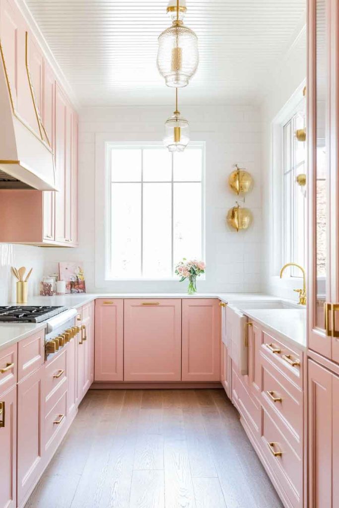
This charming kitchen features dusty pink cabinets that create a soft, romantic atmosphere when paired with warm brass hardware and fixtures. The muted pink is sophisticated rather than overly feminine, offering personality without being overwhelming.
White or cream countertops provide contrast and keep the space feeling fresh, while a simple white backsplash allows the pink to be the star. Brass pendant lights and cabinet pulls add warmth and a touch of glamour.
The combination of dusty pink and brass creates an elegant, vintage-inspired aesthetic. This unexpected color choice brings personality and warmth to the kitchen while remaining tasteful and refined.
It’s perfect for those who want something unique but still sophisticated.
Design Tips:
- Choose a muted, dusty pink rather than a bright or hot pink
- Balance pink cabinets with neutral walls, counters, and floors
- Use brass fixtures and hardware to add warmth and tie the look together
- Keep the backsplash simple to allow the cabinet color to shine
10. Forest Green and Copper Kitchen
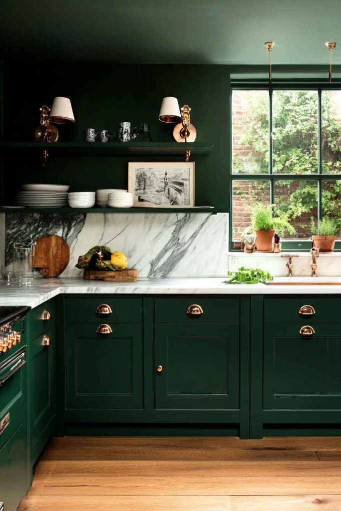
This rich, dramatic kitchen showcases deep forest green cabinets paired with warm copper accents and fixtures. The dark green creates a bold, sophisticated backdrop, while copper hardware, light fixtures, and even a copper sink add warmth and visual interest.
White or light-colored countertops provide necessary contrast, and natural light from windows prevents the space from feeling too dark. Open shelving with copper brackets displays dishes and adds dimension to the space.
This color scheme creates a cozy, jewel-toned atmosphere that feels both luxurious and inviting. The forest green brings depth and personality, while the copper introduces warmth that keeps the space from feeling too heavy or dark.
It’s ideal for those who appreciate bold, confident design choices.
Design Tips:
- Use forest green on lower cabinets and a lighter color on uppers if full green feels too bold
- Choose copper fixtures that will develop a natural patina over time
- Incorporate white or cream counters and backsplash for balance
- Add plants and natural elements to complement the organic green color
11. Warm Grey and Walnut Kitchen
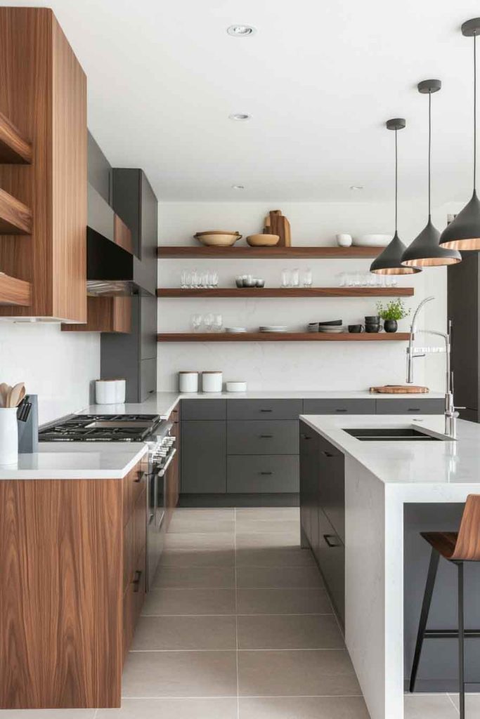
In this contemporary kitchen, warm grey cabinets create a sophisticated foundation paired with rich walnut wood accents. The grey provides a modern, neutral backdrop, while walnut floating shelves, countertops, or a kitchen island add natural warmth and organic beauty.
White or light grey walls keep the space feeling open, and stainless steel appliances integrate seamlessly. The grain patterns in the walnut add visual interest and texture to the clean lines of the grey cabinets.
This combination creates a balanced, modern aesthetic that feels both polished and warm. The grey prevents the space from feeling too rustic, while the walnut ensures it doesn’t feel cold or sterile.
It’s a perfect middle ground for those who want contemporary style with natural warmth.
Design Tips:
- Choose a grey with warm undertones to complement the walnut
- Use walnut for select elements rather than overwhelming the space
- Incorporate both matte and polished finishes for depth
- Add simple black or stainless hardware for a clean, modern look
12. Bright White and Stainless Steel Kitchen
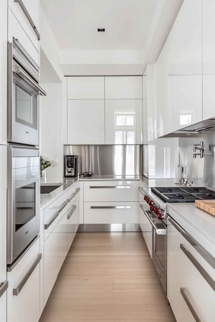
This sleek, modern kitchen features bright white cabinets throughout, creating a clean canvas that’s elevated by stainless steel appliances, hardware, and accents. The all-white cabinetry reflects maximum light and creates a sense of spaciousness.
Professional-grade stainless steel appliances make a statement, while stainless steel countertops or backsplash add an industrial edge. The reflective surfaces bounce light around the room, enhancing the bright, airy feeling.
This design emphasizes cleanliness, efficiency, and modern style. The combination of white and stainless creates a professional, chef-worthy kitchen that’s both beautiful and highly functional.
It’s perfect for serious home cooks who appreciate clean, uncluttered spaces.
Design Tips:
- Choose cabinets with minimal hardware for a streamlined look
- Keep stainless steel finishes consistent across all appliances and fixtures
- Add warmth with wooden cutting boards or a single wooden element
- Incorporate glass-front cabinets to break up the solid white surfaces
13. Taupe and Brass Kitchen
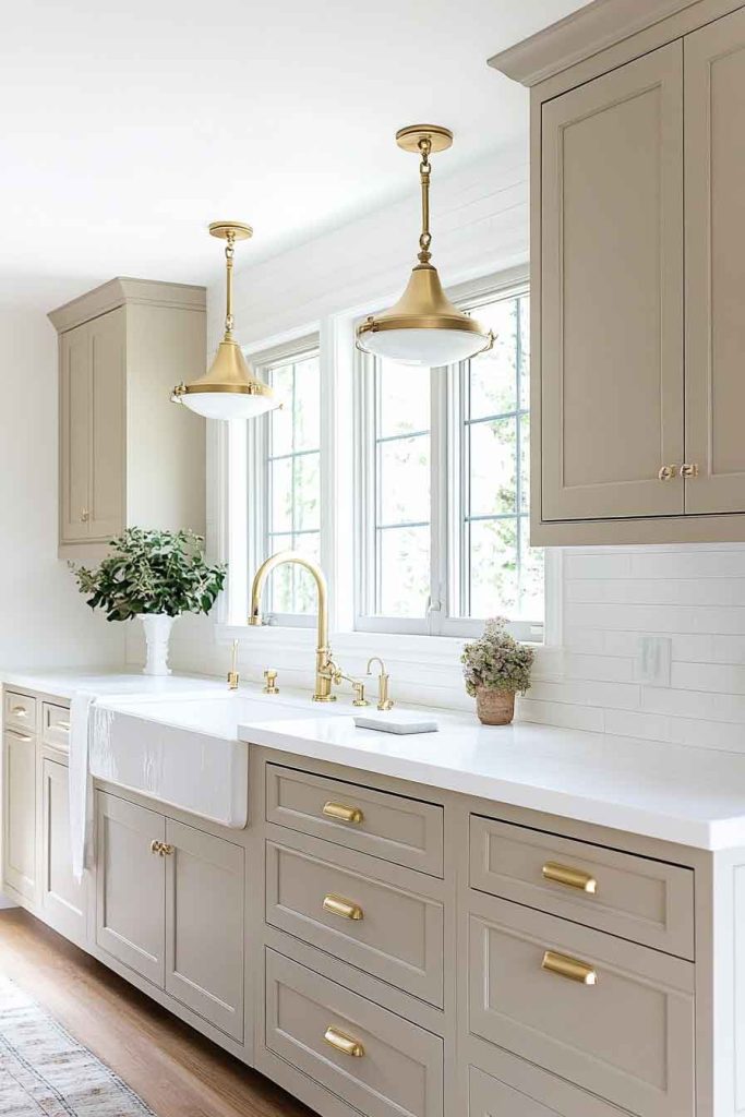
This understated yet elegant kitchen showcases taupe cabinets that create a warm, neutral foundation paired with brass hardware and light fixtures. The taupe color is sophisticated and versatile, offering more warmth than grey but remaining neutral enough to work with many styles.
Cream or off-white countertops complement the taupe beautifully, while a simple subway tile backsplash keeps the focus on the cabinet color. Brass accents add a touch of luxury without overwhelming the subtle color palette.
The combination of taupe and brass creates a refined, timeless aesthetic. This color scheme feels expensive and well-considered, offering personality without being trendy or bold.
It’s ideal for those who appreciate understated elegance and neutral palettes.
Design Tips:
- Select a taupe with warm undertones for a cozy feel
- Use brass hardware and fixtures consistently throughout the space
- Pair with cream or ivory rather than stark white for a cohesive look
- Add texture through natural materials like wood, stone, or linen
14. Two-Tone Blue and White Kitchen
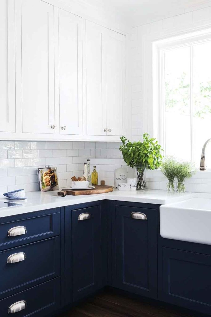
In this fresh, coastal-inspired kitchen, navy blue lower cabinets anchor the space while crisp white upper cabinets keep it feeling bright and open. The two-tone approach adds visual interest and dimension while maintaining balance.
White countertops and a white subway tile backsplash tie the upper and lower sections together. Brushed nickel or chrome hardware provides a clean, contemporary finish that works with both colors.
This design creates a dynamic yet balanced look that feels both bold and approachable. The navy adds personality and depth, while the white ensures the space remains bright and airy.
The contrast between the two creates natural visual interest without requiring additional decoration.
Design Tips:
- Use darker color on lower cabinets to ground the space
- Keep upper cabinets white or light to maintain an open feel
- Choose hardware that works with both colors
- Add a white or light-colored backsplash to bridge the two cabinet colors
15. Mint Green and Gold Kitchen
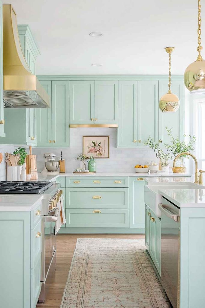
This refreshing kitchen features soft mint green cabinets that create a cheerful, retro-inspired atmosphere paired with gold hardware and fixtures. The mint brings freshness and personality, while the gold adds warmth and a touch of glamour.
White marble or quartz countertops keep the space feeling clean and bright, and a white backsplash allows the mint to be the focal point. Gold pendant lights and cabinet pulls tie the color scheme together beautifully.
This combination creates a playful yet sophisticated aesthetic reminiscent of mid-century design. The mint is cheerful without being childish, and the gold elevates the look to something special and refined.
It’s perfect for those who want a kitchen with personality and vintage charm.
Design Tips:
- Choose a soft, muted mint rather than a bright or neon green
- Use gold accents sparingly to add luxury without overwhelming
- Keep counters and backsplash neutral to balance the mint cabinets
- Incorporate vintage-inspired accessories to enhance the retro feel
16. Graphite and White Oak Kitchen
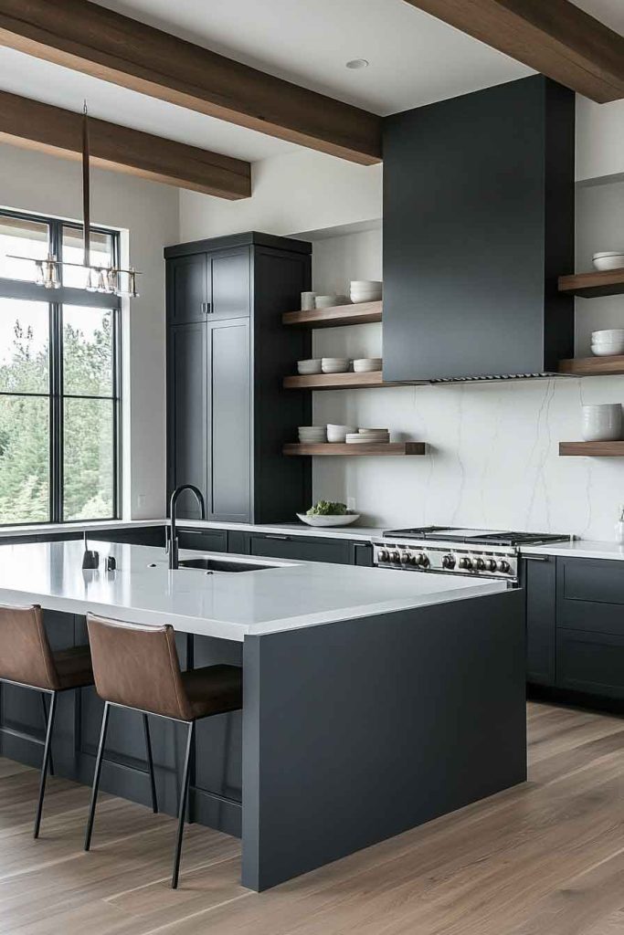
This modern kitchen showcases deep graphite grey cabinets that create dramatic contrast when paired with light white oak wood elements. The dark graphite provides a contemporary, moody foundation, while white oak floating shelves, countertops, or an island introduce natural warmth and texture.
White or light grey walls prevent the space from feeling too dark, and large windows maximize natural light. The pale wood grain adds softness to the strong graphite color, creating perfect balance.
The combination of graphite and white oak creates a sophisticated, contemporary aesthetic that feels both bold and organic. The dark cabinets make a strong statement, while the light wood ensures the space remains inviting and warm.
It’s ideal for those who appreciate modern design with natural elements.
Design Tips:
- Install excellent lighting to showcase the dark cabinets
- Use white oak for select features rather than overwhelming the space
- Choose matte finishes on cabinets for a contemporary look
- Add black or dark bronze hardware to complement the graphite
17. Cream and Olive Green Kitchen
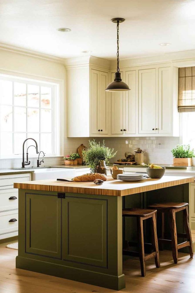
In this earthy, sophisticated kitchen, cream-colored cabinets provide a soft foundation paired with olive green accent walls or an olive green island. The cream creates warmth without the starkness of white, while the olive introduces nature-inspired color.
Natural wood countertops or butcher block enhance the organic feel, and brass or bronze hardware adds warmth. The combination creates a cohesive, natural palette that feels grounded and welcoming.
This color scheme promotes a sense of calm and connection to nature. The cream and olive work together harmoniously, creating a kitchen that feels both refined and relaxed.
It’s perfect for those who appreciate earthy, organic color palettes.
Design Tips:
- Use olive as an accent color rather than the dominant cabinet color
- Choose cream rather than stark white for a warmer overall feel
- Incorporate natural materials like wood, stone, and woven textures
- Add plants and herbs to enhance the natural, organic theme
18. Light Grey and Black Kitchen
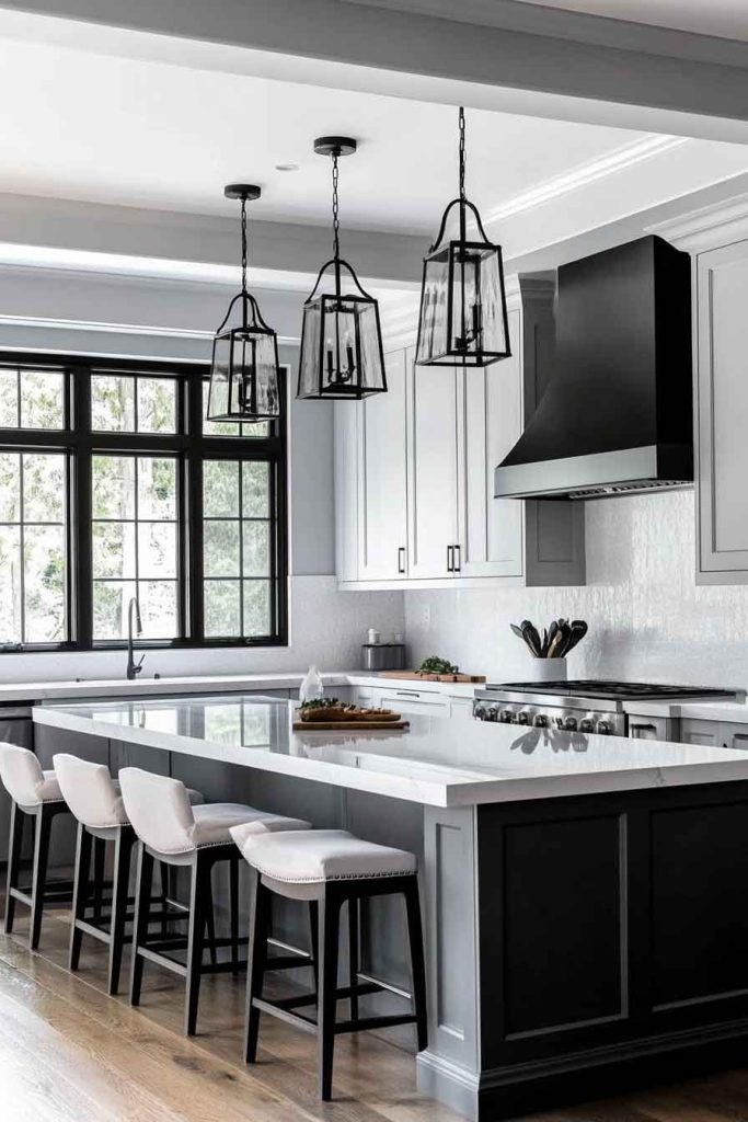
This contemporary kitchen features light grey cabinets that create a modern foundation paired with bold black accents. The light grey provides a soft, neutral base, while black hardware, light fixtures, window frames, or a black island add definition and contrast.
White countertops keep the space feeling bright, and a simple backsplash allows the cabinet colors to shine. The combination of light and dark creates visual drama without overwhelming the space.
This color scheme emphasizes clean, modern lines and strong contrasts. The grey is sophisticated and versatile, while the black accents add graphic punch and prevent the space from feeling too soft or bland.
It’s ideal for those who appreciate contemporary design with clear definition.
Design Tips:
- Use black sparingly as an accent to avoid overwhelming the light grey
- Choose matte black hardware and fixtures for a modern look
- Keep countertops light to maintain brightness
- Incorporate both warm and cool elements to balance the neutral palette
19. Warm White and Terracotta Kitchen
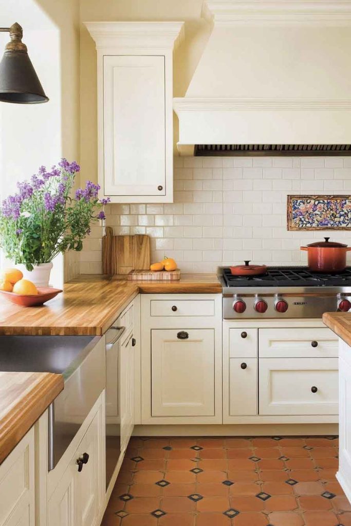
This inviting kitchen showcases warm white cabinets that create a cozy foundation paired with terracotta tile flooring or a terracotta-painted accent wall. The warm white has creamy undertones that complement the earthy terracotta beautifully.
Wooden countertops or butcher block add additional warmth, while brass or copper hardware ties the warm palette together. Natural light enhances the sun-baked, Mediterranean feel of the color scheme.
The combination of warm white and terracotta creates a cozy, welcoming atmosphere with rustic charm. This palette evokes the warmth of Mediterranean homes while remaining versatile enough for various design styles.
It’s perfect for those who want a kitchen that feels warm and lived-in.
Design Tips:
- Choose a warm white with cream or ivory undertones
- Use terracotta for flooring or as an accent rather than on all cabinets
- Incorporate natural materials and textures throughout
- Add greenery and plants to complement the earthy color palette
20. Slate Blue and Brass Kitchen
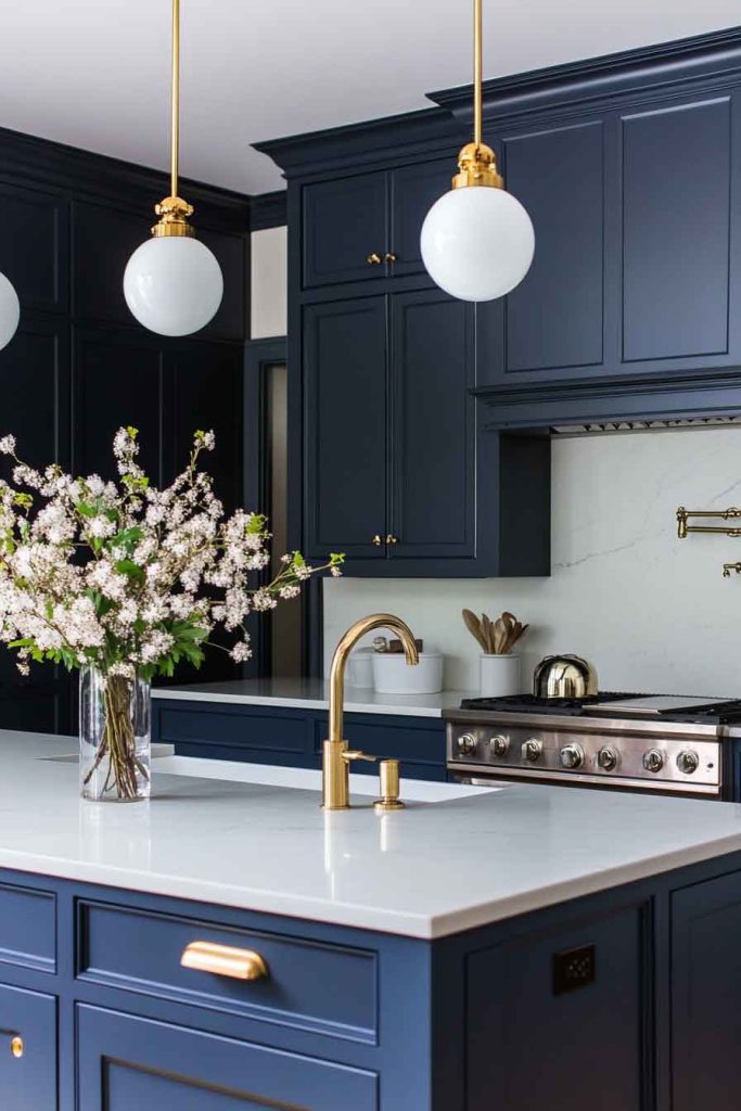
In this elegant kitchen, slate blue cabinets create a sophisticated, moody atmosphere paired with warm brass hardware and fixtures. The slate blue offers more depth than powder blue while remaining softer than navy.
White or cream marble countertops provide contrast and elegance, while a simple white backsplash keeps the focus on the beautiful cabinet color. Brass pendant lights and hardware add warmth and luxury.
This color combination creates a refined, upscale aesthetic that feels both current and timeless. The slate blue brings personality and depth, while the brass introduces warmth that prevents the space from feeling too cool.
It’s ideal for those who want sophisticated color without going too dark.
Design Tips:
- Choose slate blue with grey undertones for sophistication
- Use brass fixtures consistently throughout for cohesion
- Pair with white or cream counters to balance the blue
- Add texture through natural materials and varied finishes
21. Espresso and Cream Kitchen
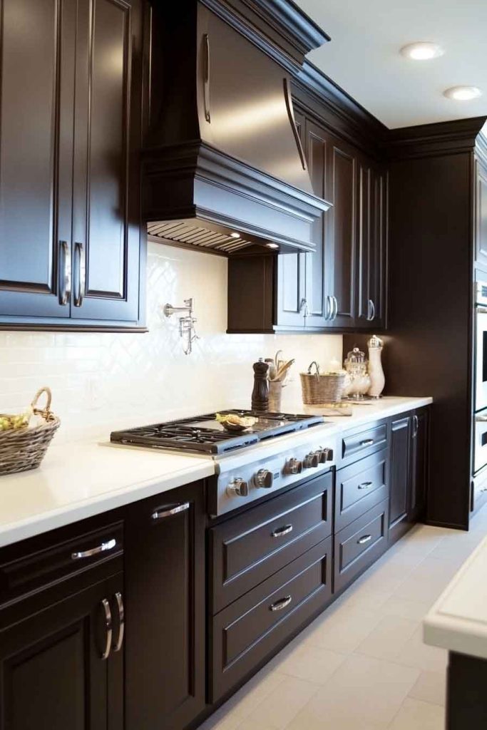
This warm, classic kitchen features rich espresso brown cabinets that create depth paired with cream-colored countertops and walls. The dark brown adds richness and elegance, while the cream prevents the space from feeling too heavy or dark.
Cream subway tile backsplash and cream or beige counters provide necessary contrast, and under-cabinet lighting ensures the space feels warm rather than dim. Bronze or oil-rubbed bronze hardware complements the brown cabinetry beautifully.
The combination of espresso and cream creates a traditional, timeless aesthetic with warmth and sophistication. The dark cabinets add drama and richness, while the cream elements keep the space feeling inviting and balanced.
It’s perfect for those who appreciate classic, warm color palettes.
Design Tips:
- Install plenty of lighting to prevent dark cabinets from dimming the space
- Use cream rather than stark white for a warmer overall feel
- Choose hardware in warm metallic finishes
- Add a light-colored floor to balance the dark upper cabinetry
22. Soft Grey-Green and White Kitchen
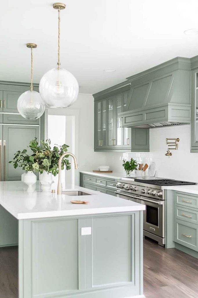
This serene kitchen showcases soft grey-green cabinets that create a calming atmosphere paired with bright white countertops and walls. The grey-green is subtle and sophisticated, offering the freshness of green with the neutrality of grey.
White quartz or marble counters provide a clean, bright work surface, while a white subway tile backsplash keeps the look classic. Brushed nickel or chrome hardware maintains the cool, calm color palette.
This color scheme promotes tranquility and balance. The grey-green is calming without being boring, and the white ensures maximum brightness and a sense of cleanliness.
It’s ideal for those who want subtle color that feels peaceful and sophisticated.
Design Tips:
- Choose a grey-green with balanced undertones
- Keep counters and backsplash white for maximum contrast
- Use cool-toned hardware to complement the color palette
- Add plants and natural elements to enhance the organic feel
23. Cherry Wood and Cream Kitchen
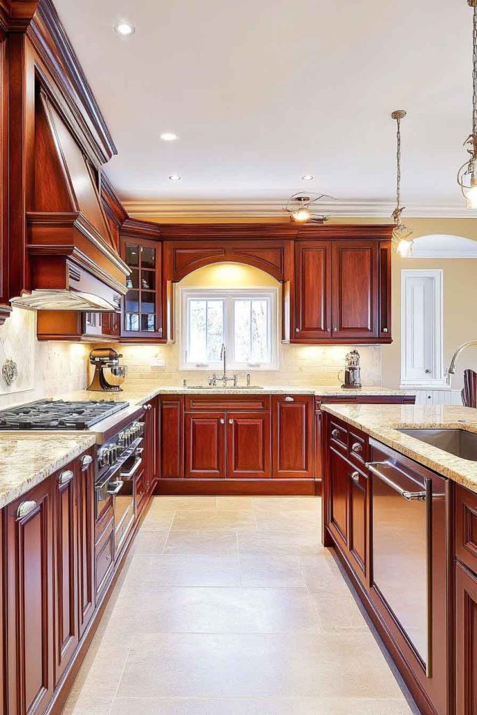
In this warm, traditional kitchen, rich cherry wood cabinets create a classic, luxurious foundation paired with cream-colored countertops and walls. The cherry wood brings natural beauty with its reddish-brown tones and distinctive grain patterns.
Cream granite or quartz counters complement the warm wood beautifully, while a cream or beige backsplash ties the elements together. Bronze or brass hardware adds warmth and traditional elegance.
The combination of cherry and cream creates a timeless, upscale aesthetic with natural warmth. The wood brings richness and character, while the cream keeps the space feeling balanced and sophisticated.
It’s perfect for those who appreciate traditional design and natural wood beauty.
Design Tips:
- Choose quality cherry wood that will age beautifully over time
- Use cream rather than white to complement the warm wood tones
- Incorporate under-cabinet lighting to highlight the wood grain
- Add warm metallic hardware in brass or bronze finishes
24. Pale Blue-Grey and Marble Kitchen
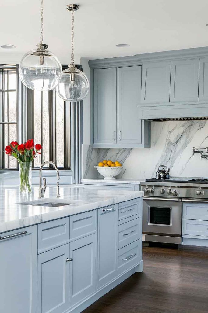
This elegant kitchen features pale blue-grey cabinets that create a soft, sophisticated foundation paired with white marble countertops. The blue-grey is subtle and refined, offering just a hint of color while remaining neutral enough for any style.
White marble with grey veining complements the cabinet color perfectly, creating a cohesive, high-end look. Chrome or brushed nickel hardware keeps the cool color palette consistent, and large windows maximize natural light.
This color scheme creates a serene, spa-like atmosphere. The pale blue-grey is calming and sophisticated, while the marble adds natural beauty and elegance.
It’s ideal for those who want a kitchen that feels peaceful, clean, and refined.
Design Tips:
- Choose a blue-grey with balanced cool undertones
- Select marble with veining that complements the cabinet color
- Use cool-toned hardware for consistency
- Maximize natural light to showcase the subtle cabinet color
25. Charcoal and Warm Wood Kitchen
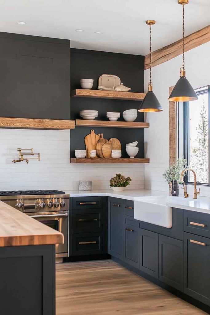
This contemporary kitchen showcases charcoal grey cabinets that create a bold, modern foundation paired with warm wood accents throughout. The deep charcoal provides drama and sophistication, while wood floating shelves, a wood island top, or wood accent walls introduce natural warmth.
White or light countertops balance the dark cabinets, and excellent lighting ensures the space feels inviting rather than dim. The contrast between the cool charcoal and warm wood creates visual interest and depth.
The combination of charcoal and wood creates a modern aesthetic with natural warmth. The dark cabinets make a strong design statement, while the wood elements ensure the space remains approachable and inviting.
It’s perfect for those who want contemporary style that doesn’t feel cold.
Design Tips:
- Install excellent lighting to showcase the dark cabinets
- Use wood as an accent to add warmth without overwhelming
- Choose light countertops to balance the dark cabinetry
- Incorporate both matte and natural finishes for textural interest
26. Soft Yellow and White Kitchen
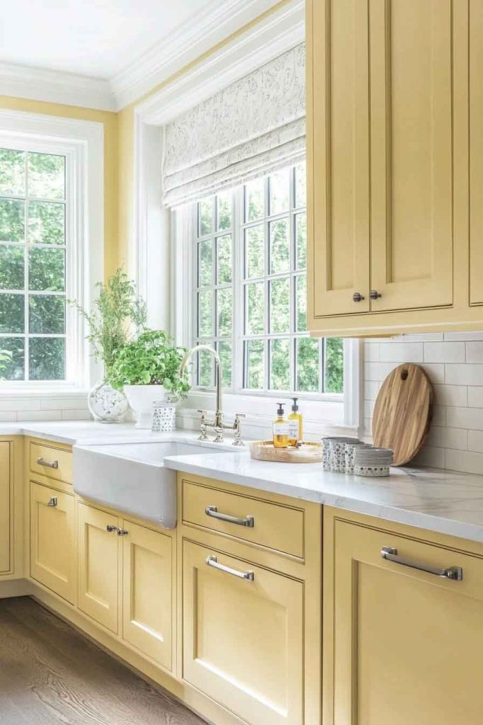
In this cheerful kitchen, soft butter yellow cabinets create a sunny, welcoming atmosphere paired with crisp white countertops and walls. The yellow brings warmth and happiness without being overly bright or overwhelming.
White quartz or marble counters provide a clean contrast, while a white subway tile backsplash keeps the look classic and fresh. Brushed nickel or chrome hardware maintains the light, bright feeling.
This color scheme creates an uplifting, optimistic atmosphere. The soft yellow brings sunshine and warmth to the space, while the white ensures it remains fresh and clean.
It’s ideal for those who want a kitchen that feels happy and welcoming.
Design Tips:
- Choose a soft, buttery yellow rather than a bright or neon shade
- Keep walls and counters white to balance the yellow cabinets
- Use simple hardware that doesn’t compete with the cabinet color
- Add white or light-colored accessories to maintain brightness
27. Black and Natural Wood Kitchen
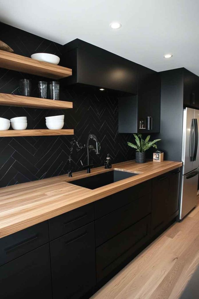
This dramatic, modern kitchen features matte black cabinets that create a bold statement paired with natural wood countertops or accents. The black provides maximum contrast and contemporary edge, while wood elements introduce organic warmth.
A white or light backsplash prevents the space from feeling too dark, and excellent lighting is essential. Wood countertops, floating shelves, or a wood island top soften the black and add natural beauty.
The combination of black and wood creates a striking, modern aesthetic with natural balance. The black makes a confident design statement, while the wood ensures the space doesn’t feel cold or unwelcoming.
It’s perfect for those who love bold, contemporary design with organic elements.
Design Tips:
- Choose matte black cabinets for a modern, sophisticated look
- Use wood for select elements to add warmth strategically
- Install excellent lighting throughout the space
- Keep backsplash and some counters light to balance the black
28. Lavender Grey and White Kitchen
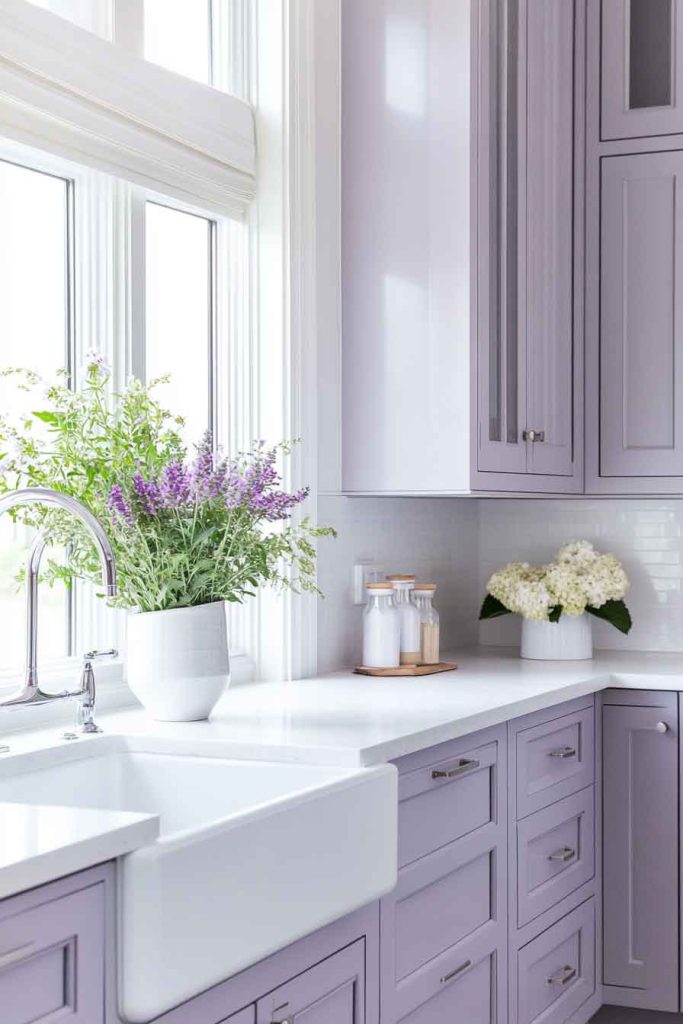
This unique kitchen showcases soft lavender grey cabinets that create an unexpected, elegant atmosphere paired with bright white countertops and walls. The lavender grey is subtle and sophisticated, offering a hint of purple while remaining neutral and versatile.
White quartz or marble counters keep the space feeling fresh and clean, while a simple white backsplash allows the cabinet color to be the focus. Silver or chrome hardware complements the cool color palette.
This color scheme creates a distinctive, elegant aesthetic. The lavender grey is unusual enough to feel special but subtle enough to work with many styles.
It’s ideal for those who want something different but still sophisticated.
Design Tips:
- Choose a lavender grey with strong grey undertones for sophistication
- Keep all other elements white or neutral to let the cabinets shine
- Use cool-toned hardware for consistency
- Add fresh flowers or lavender accessories to enhance the color theme
29. Warm Beige and Bronze Kitchen
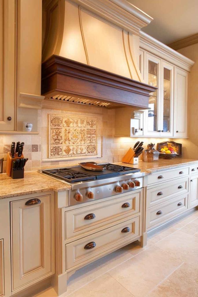
In this cozy, traditional kitchen, warm beige cabinets create a neutral foundation paired with bronze hardware and fixtures. The beige offers warmth and versatility, working with many design styles from traditional to transitional.
Cream or tan countertops complement the beige beautifully, while a neutral backsplash ties everything together. Bronze cabinet pulls, faucets, and light fixtures add warmth and an aged, elegant quality.
The combination of beige and bronze creates a warm, inviting atmosphere with timeless appeal. The beige is neutral but warm, while the bronze adds character and depth.
It’s perfect for those who want a kitchen that feels comfortable and welcoming.
Design Tips:
- Choose beige with warm undertones for a cozy feel
- Use bronze fixtures consistently throughout for cohesion
- Pair with cream or tan rather than stark white
- Add natural textures through wood, stone, and woven materials
30. Pewter Grey and Marble Kitchen
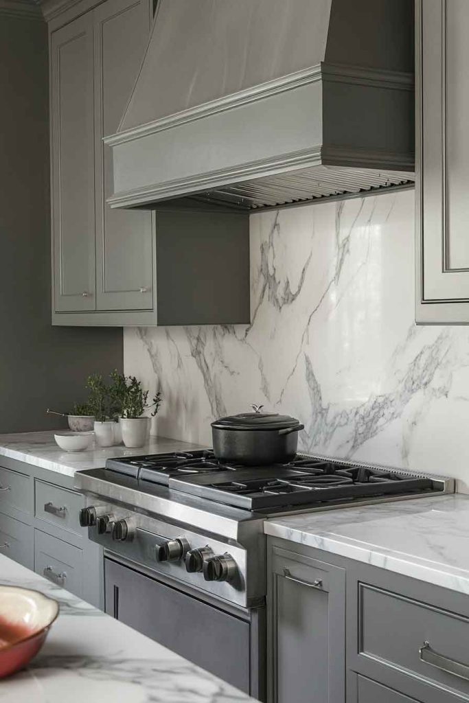
This sophisticated kitchen features pewter grey cabinets that create an elegant, neutral foundation paired with luxurious marble countertops and backsplash. The pewter grey is refined and versatile, offering the neutrality of grey with a subtle sheen.
White marble with grey and white veining complements the cabinet color perfectly, creating a cohesive, high-end aesthetic. Polished chrome or nickel hardware adds shine and elegance, and excellent lighting showcases the beautiful materials.
The combination of pewter and marble creates a luxurious, timeless aesthetic. The grey is sophisticated without being too bold, while the marble adds natural beauty and elegance.
It’s ideal for those who want a kitchen that feels upscale and refined.
Design Tips:
- Choose pewter grey with neutral undertones
- Select marble that complements the cabinet color
- Use polished hardware for an elegant finish
- Install excellent lighting to showcase the beautiful materials
Conclusion
Creating the perfect kitchen color scheme is an art that balances personal style, functionality, and timeless design principles. Each color combination highlighted in this guide offers unique possibilities for transforming your cooking space into a beautiful, functional environment that reflects your personality.
Whether you prefer the classic elegance of white and grey, the bold drama of navy and brass, or the warm comfort of cream and terracotta, these color schemes provide abundant inspiration for your kitchen transformation. The right color combination can completely change how your kitchen feels and functions, making it a space you’ll love spending time in.
Don’t hesitate to experiment with these concepts and adapt them to your personal style. Consider your home’s overall aesthetic, the amount of natural light your kitchen receives, and how you use the space daily. With thoughtful color selection and attention to detail, you can create a kitchen that’s not only beautiful but also perfectly suited to your lifestyle and needs.

